
ALF Branding
FOCUSING ON LIVER HEALTH, NOT LIVER DISEASE
The worldwide challenges faced over the last two years have changed almost everything we know about humanity and the world; the American Liver Foundation (ALF) was not immune to this phenomenon. In 2021, we took a deep dive to determine who our audience was and what their interests were. From our database and social media platforms to our web traffic and potential media touches – we left no stone unturned. One of our largest findings was that people are more interested in liver health – not liver disease.
After the hire of ALF’s new Chief Marketing & Communications Officer, Julie Kimbrough, in December 2021, the Marketing & Communications team worked with trusted National Board Members and key stakeholders in the industry to refocus the brand and shift our messaging to liver wellness rather than illness. Peter Cullen, National Board of Directors and Marketing & Communications Committee Member for ALF is an accomplished media executive and was eager to help us tackle this major undertaking. Peter said, “As a person who has experienced liver disease and has participated in ALF events for over a decade, I know the power ALF has to make someone’s life better while they move through their unique liver journey. Watching ALF transition to a visionary, mission-driven national leader in the liver space created a need to translate the powerful spirit of hope that I witnessed at local events into a national brand. A unique, distinctive national brand that once seen, lets you know you’re in the right place to gain support, encouragement, knowledge and community. Whether interacting with the ALF brand online, in print, video or in person, it is critical for patients to know they’re in the right place.”
TWO WORLDS COLLIDE
Peter continued by saying, “I have been extremely fortunate to have survived some serious health setbacks. As a two-time liver transplant recipient and a survivor of three serious cancers, I have benefited from the selfless sacrifices of others. Having spent over a decade of my career in marketing with the Walt Disney Company, I know the importance of developing and maintaining a strong brand to help an organization achieve its objectives.”
To help on the graphic design portion of this brand refresh project, Peter recruited his longtime friend and colleague, John Polachek, to help make this dream a reality. John is the Vice President of Creative Services at Wovenmedia, a full-service digital signage platform for enterprises with advantages for captivating audiences and driving sales. John has worked with several fortune-500 companies like Adidas, Disney, the NFL and MLB, Universal Studios, Walmart and Visa, just to name a few. John said, “When Peter first asked me to help, I said, absolutely! Peter was a big supporter of mine when we worked together. He has been through so much with liver disease and has worked so hard to give back so, if he needed my help, I was in 100%.”
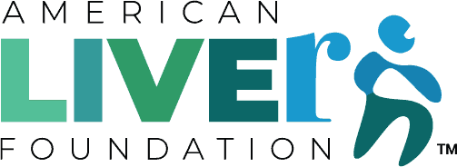
TWO SIMPLE, YET POWERFUL, CONCEPTS
What ALF tries to convey in our new brand logo, colors and messaging are two simple, yet powerful concepts:
- The importance of truly "living" one's best life in every stage of their liver journey;
- The power of the "next step".
Peter said, “in the new logo design, we emphasize the word "live" in liver to highlight that just because you have liver disease, doesn’t mean you have to stop living. The new color palette embraces hues of green and blue promoting health, tranquility, hopefulness and optimism. The new logo is also in motion, emphasizing the "next step" towards reclaiming your health. Sometimes that step is a blood test to assess the best course of treatment, sometimes it's a drug to help treat underlying causes or sometimes it's joining a Liver Life Walk with friends and family to raise awareness and support your community.”
While refreshing the brand and pivoting our message was top of mind, we couldn’t abandon the last 45 years of ALF’s excellence and recognition in the liver community. Keeping aspects of the original brand was one of our main priorities. John said, “What I started with was the word “LIVE” treated one way, followed by the “R”, treated differently. As soon as I sketched it out, I knew I had a winning idea: make a positive word like “LIVE” into “LIVER”, the organ we’re talking about, but the added notion of “being a LIVER” – or someone who LIVES LIFE – brings a new, hopeful twist to the brand. We also bred life into the character image taken from the original logo by adding a mouth and dividing him in half with a blue shirt and green pants, making him look more human.”
MOVING TOWARDS THE FUTURE
ALF is well positioned to grow over the next five years to serve the increased number of people affected by liver disease. As diseases like nonalcoholic fatty liver disease (NAFLD) and nonalcoholic steatohepatitis (NASH) affect upwards of 100 million Americans, it is more critical than ever to have a home like ALF to support our patient population and educate patients about their liver health choices. We have the opportunity to make liver health "top of mind" once people understand how important liver health is to achieving an energetic and healthy life. Peter said, “The new branding is welcoming and calming. It gives people affected by liver disease a place to come together online and/or in person so nobody feels they are taking those "next steps" alone.
PRO-BONO = PRO-BETTER
Peter and John both graciously donated their time and talents to refreshing the ALF brand. John said, “designing something pro-bono almost always produces better work, although this one was special and I’m extremely proud of where this ended up.” Peter added, “When this idea initially came up, it felt like the two primary drivers in my business and personal life collided at just the right time – this was an opportunity that I couldn’t let pass me by.”
Over the coming months our patients, families and other stakeholders will see the new brand take hold across our digital platforms. Our main website, liverfoundation.org, already includes the new logo and colors along with other updates to make the site more user friendly. More improvements to the website will gradually be made over the next couple of months.
Peter and John—we are honored to have worked with such titans in the field on the new look and feel of ALF and we are eternally grateful for your generosity of time and spirit.
Last updated on August 21st, 2023 at 12:23 pm